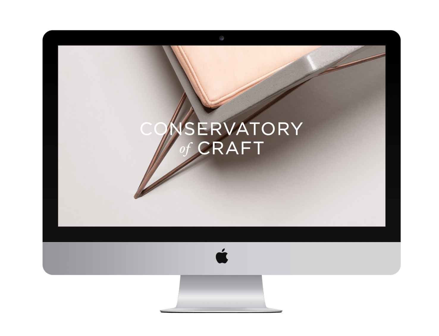
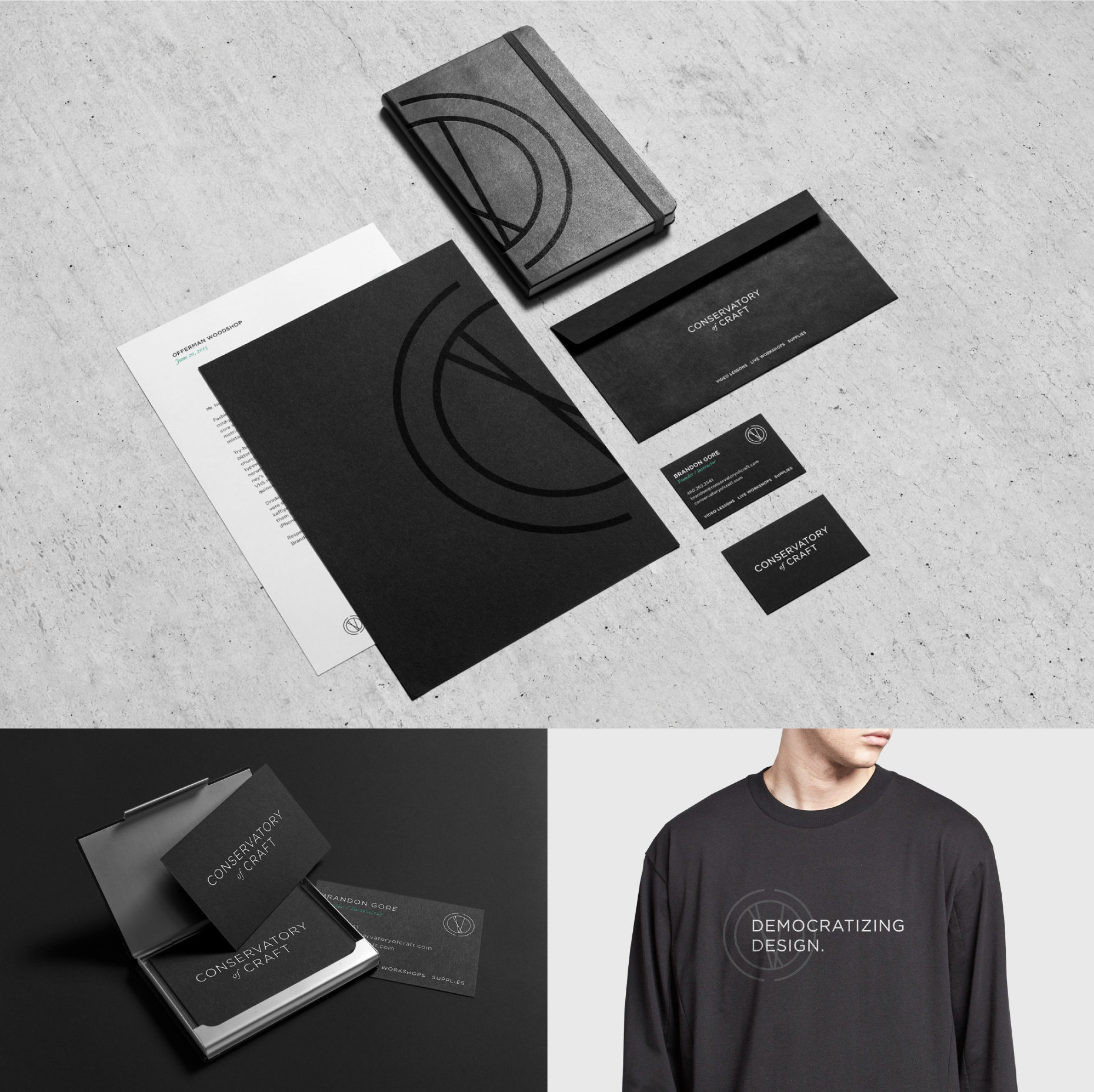
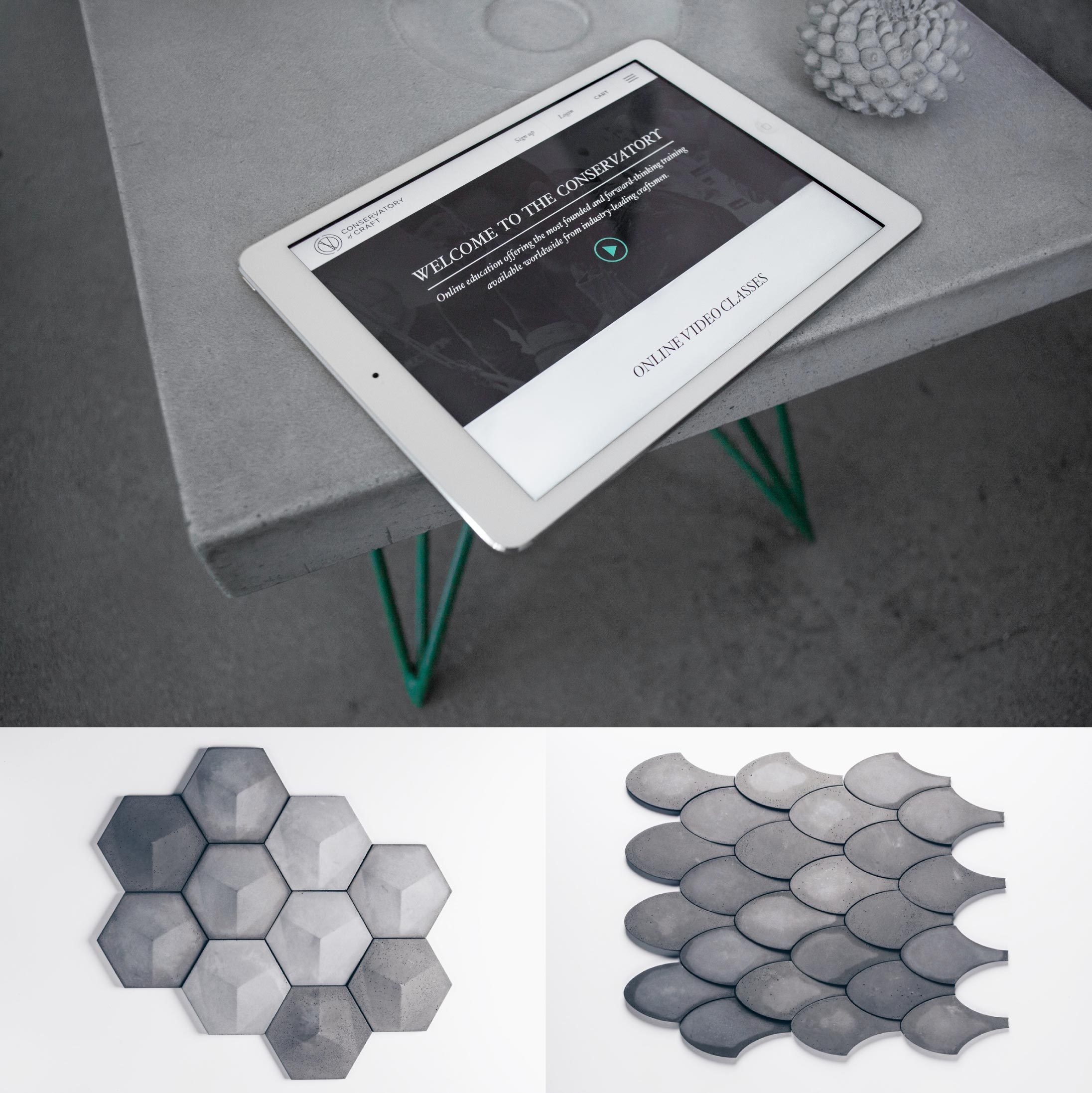
The Conservatory of Craft teaches quality design and craftsmanship through comprehensive online classes and live workshops. As a working concrete craftsman and instructor, Brandon Gore aimed to develop a digital platform for the modern maker and DIY enthusiast to explore the possibilities of concrete anywhere in the world. Gore's vision called for a memorable brand and bespoke website to embody the resources and training services needed for a growing craft community.
As a result, I helped develop the visual language of the Conservatory and took charge of planning and designing a responsive, e-commerce website that will knowingly reach a wide, recurring audience. By iterating and developing digital features based on a user-centred approach that covers memberships, online classes, live workshops, community forums and an online shop, I took ownership of creating a simple, refined aesthetic whilst encouraging accessibility, usability and confidence within a niche market.
roles: art direction, user experience, user interface, web design, brand strategy, visual identity system, logo design, project management
workflow: research, user personas, competitor analysis, benchmarking, information architecture, user journey, content development, wireframing, interactive prototyping, design mockups, usability testing
design under monomyth studio
photography provided by brandon gore



UX PROCESS
client
Brandon Gore of Hard Goods Co.
roles
Brand Strategy, Visual Identity,
UX Design, UI Design, Web Design
team
Mike Giles, Creative Director
Chip Allison, Strategic Director
Monica Mazur, Lead Designer
Cooper Richardson, Developer
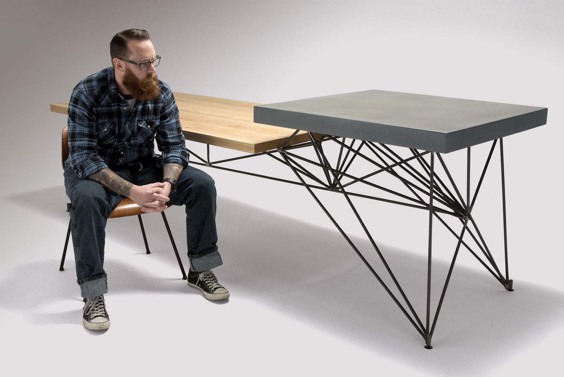
Brandon Gore is an award-winning craftsman and former judge on Spike TV’s Framework, the world’s first furniture building competition. Since 2004, he has built a successful design-build furniture business focused on concrete, steel and wood.
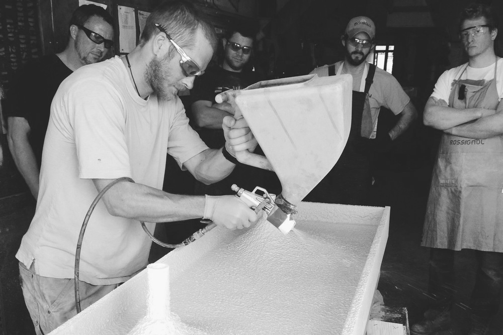
In addition to client work, Gore teaches his craft with in-person concrete workshops. With limited studio capacity and a growing community interest, Gore sought to expand his knowledge and services for all experience levels to have the opportunity to get their hands dirty. The Conservatory of Craft was born.
project goals
Create a responsive site for makers to access tools and knowledge from experts.
Use technology to expand upon the existing live workshop experience.
Become a resource hub for all things concrete and beyond in the maker space.
Create a loyal, connected customer base and community following.
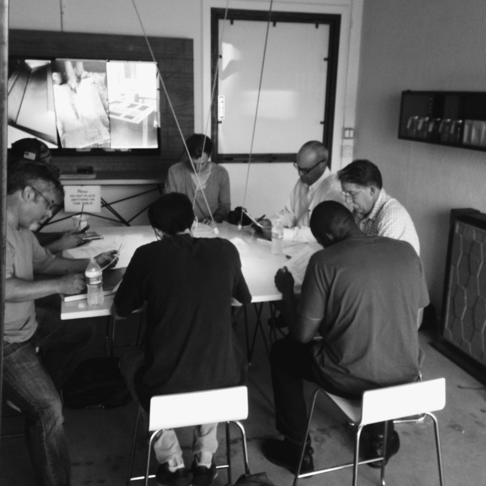
To help bring Gore’s vision to life, we tapped in to his existing customer-base of supporters and workshop alumni. We sent out survey’s to his email list and conducted several interviews to gain insight in to people’s demographics, pain points and experiences with his services.
user research
sample interview questions
needs
- Workshop classes to be more accessible and affordable
- Varying experience levels with building + designing
- Knowing what supplies + tools are best for personal projects
- More classes and services not only focusing on concrete
motivations
- Meet other makers in the community
- Learn new skills; building and/or designing
- Level up for professional endeavours
- Make something with their hands that’s functional + beautiful
frustrations
- Workshops are expensive and hard to prioritise
- Online booking system for classes is not user-friendly
- Classes get booked quick without warning
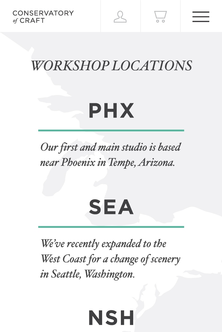
- Workshops are only available in Arizona
- Minimal information and low transparency
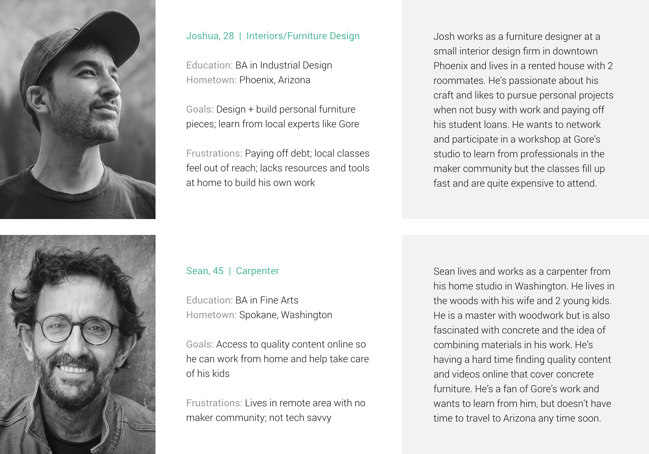
sample personas
problem statement
The maker community is looking for affordable and accessible online resources to help them with their professional or personal ambitions. They’re wanting to know the appropriate tools and techniques needed to fulfil their professional or personal ambitions.
user needs & business goals
Based on our research and insight into customer needs and how they align with Gore’s business goals, I helped structure the site map and content strategy for a responsive website that features quality resources and services customers are hungry for.
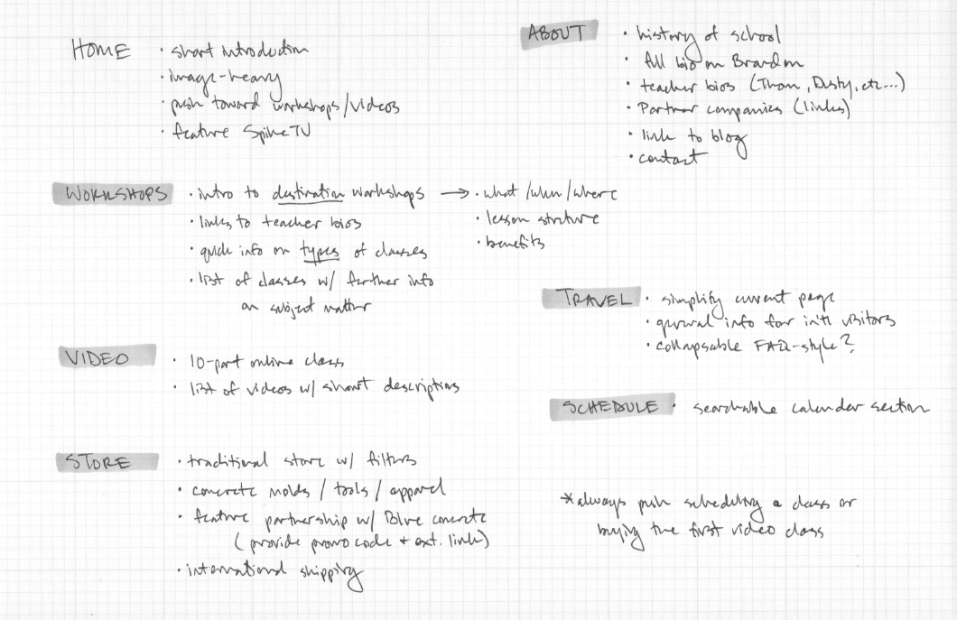
site map
user flow
customer journey
There were multiple user flows and customer journey iterations that we explored - making sure critical pain points were being addressed with a seamless journey between the various services and CTA’s across mobile, tablet and desktop.
key services
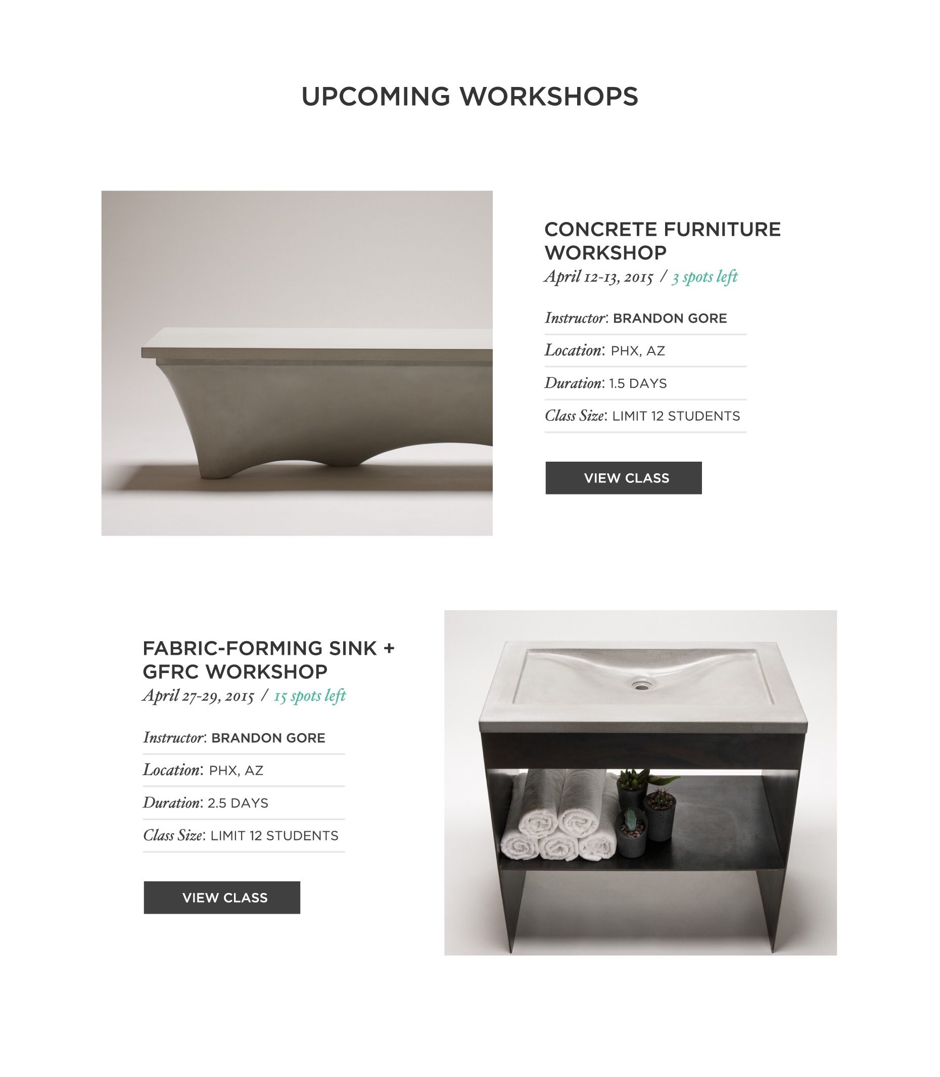
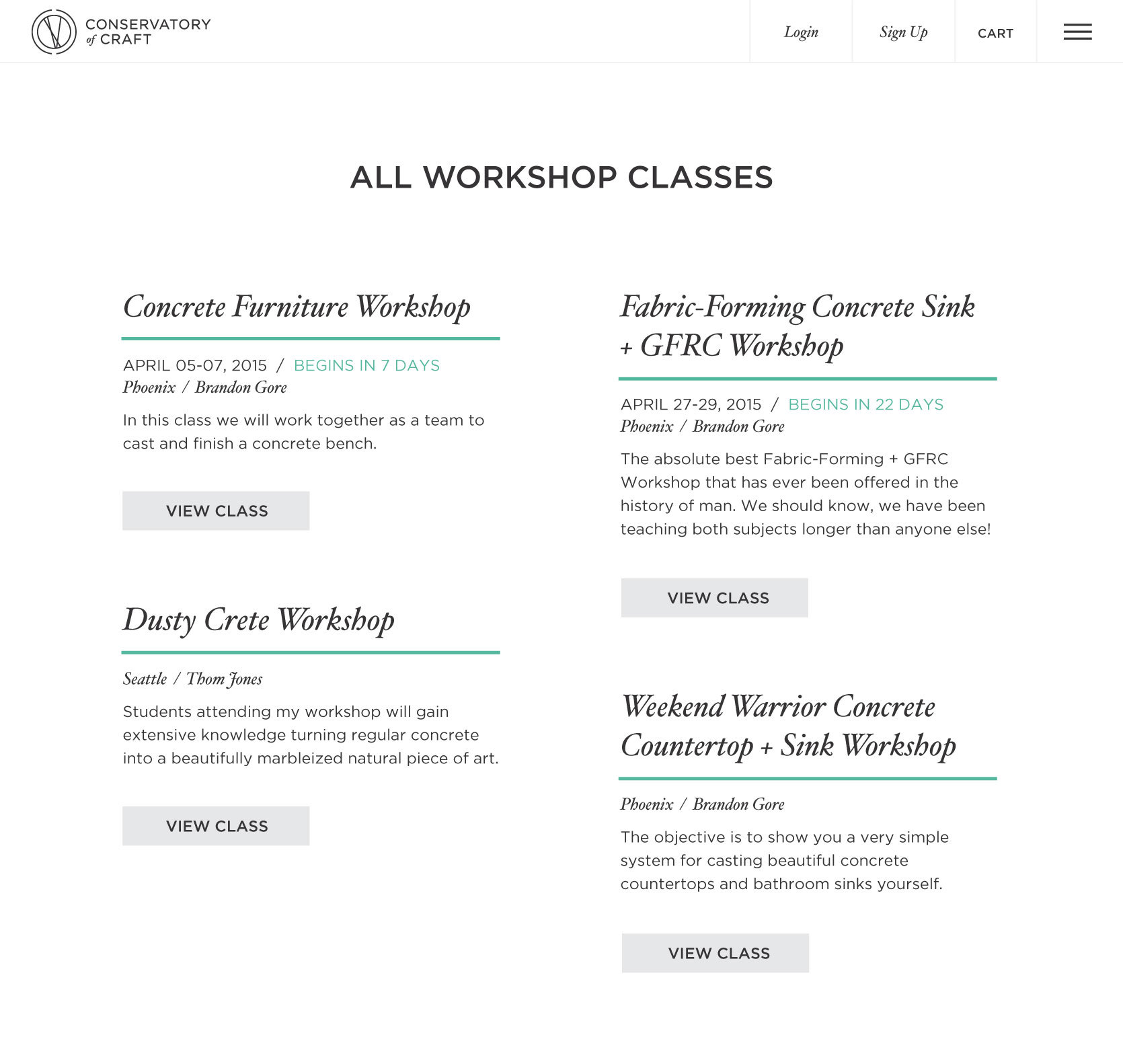
Live workshop classes offered by select instructors in various states in the US, in addition to Gore’s HQ.
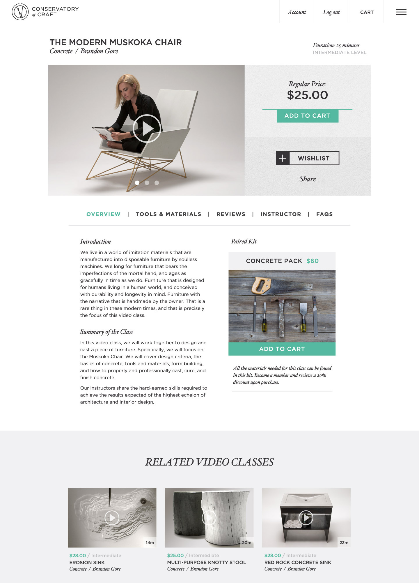
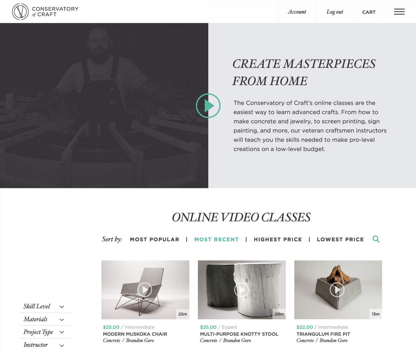
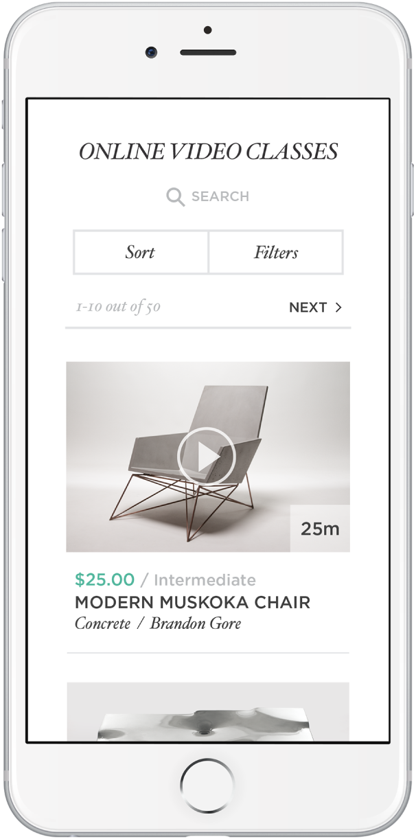
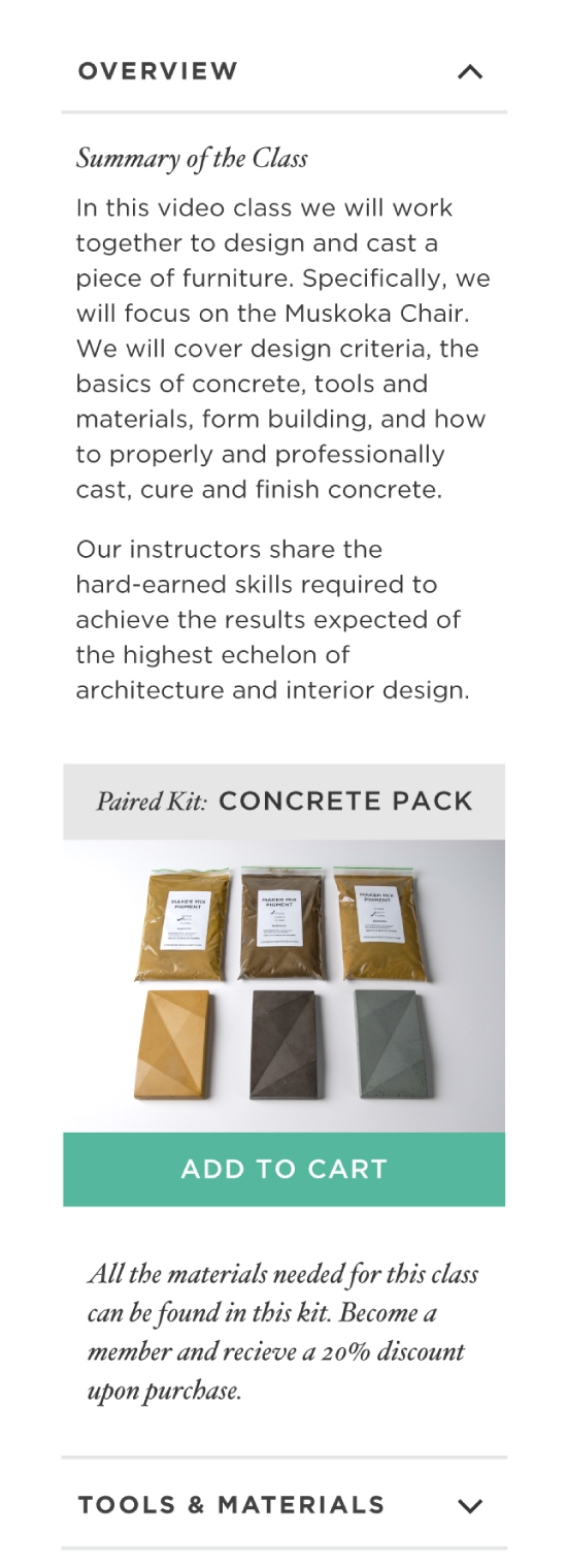
Comprehensive online video classes ranging from simple concrete moulds to large-scale furniture pieces.
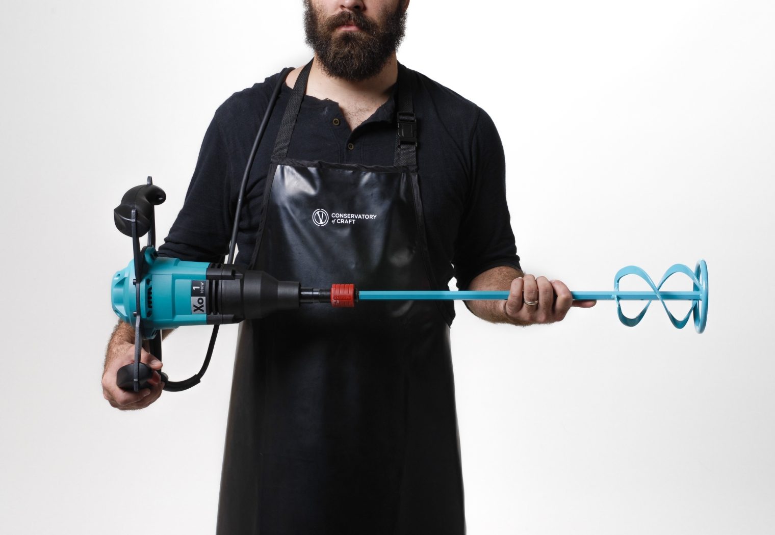
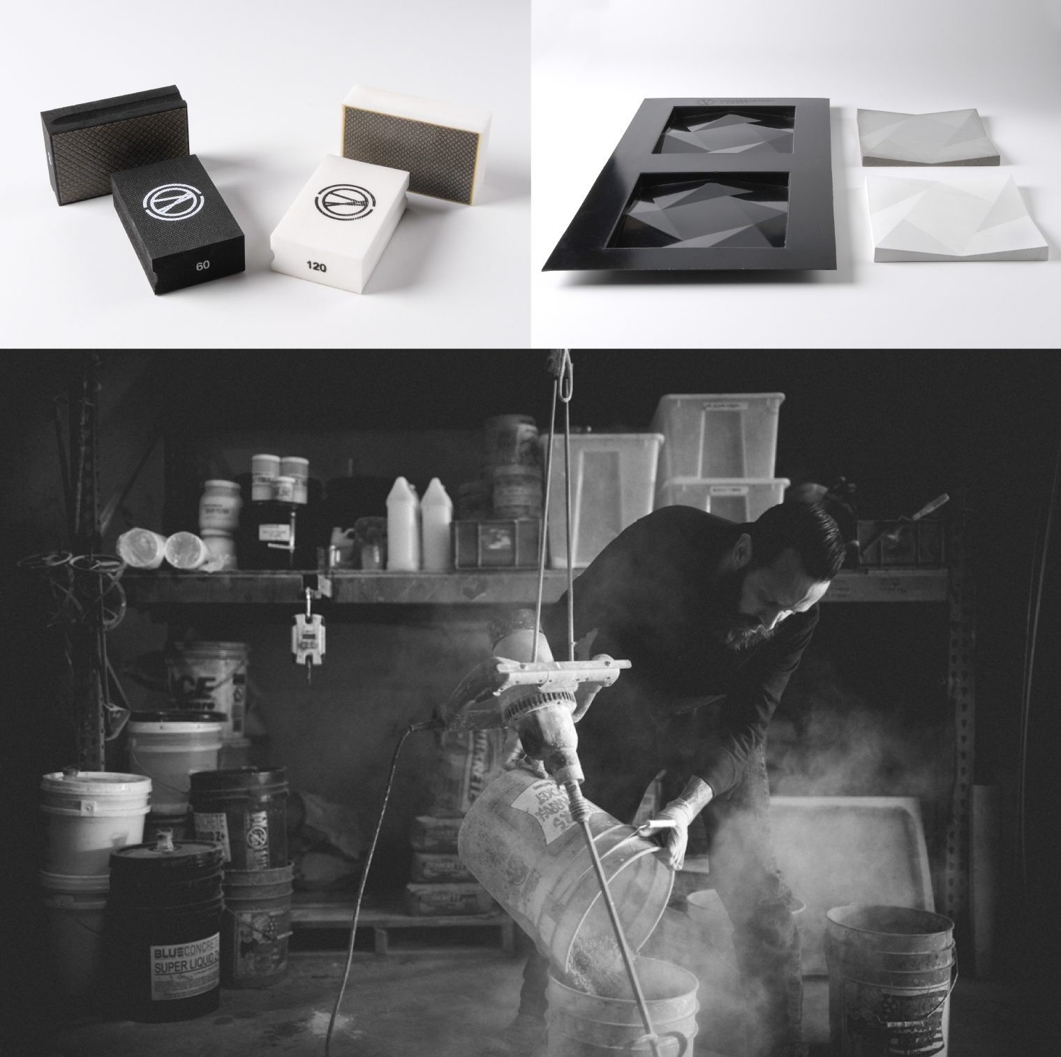
Supply shop with tools, accessories and bespoke moulds that Brandon Gore uses for his projects.
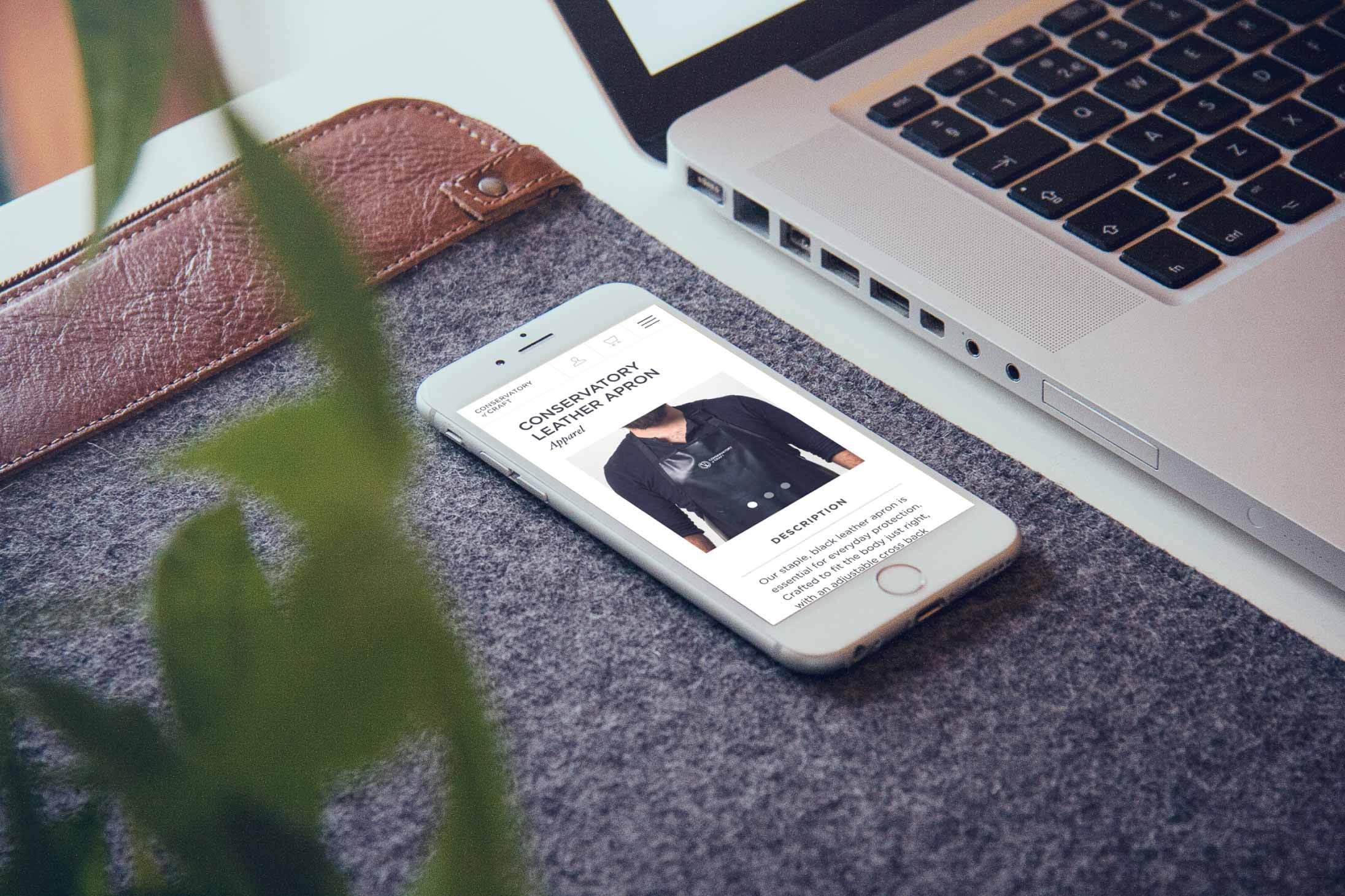
Booking and shopping experience for all classes, shop items and premium membership subscriptions.